Power
The Power page shows how your load is distributed over the selected period. The focus is on three KPIs, the Load Duration Curve, and your highest peaks.
Note: Power is part of the advanced analysis, which is included from the Plus plan upwards. It also requires at least hourly values. You can see Base load and Peak as reference lines in Consumption as well. This page puts those values in context and shows the full distribution.
Base load, peak load, and hours above threshold
At the top you see three KPIs:
- Base Load: The minimum continuous power of your connection. It is calculated as the 5th percentile (P5) of load values, meaning the power level exceeded during 95% of the time. A high base load points to devices running around the clock.
- Peak Load: The highest power value in the period. With a single metering point that is its maximum load. If you selected several metering points, we sum them per interval first: the KPI then shows their highest combined load, not the maximum of any single metering point. In that case the label also names how many metering points were summed.
- Hours above 80% of peak: How many hours the load exceeded 80% of peak load, including the share of the total period and the corresponding threshold in kW. Few such hours mean the peak comes from brief spikes. Many mean your load sits close to its maximum for long stretches.
For feed-in meters the values are named Base Generation and Peak Generation accordingly.
The Load Duration Curve
The Load Duration Curve sorts all readings in the period from highest to lowest load. The x-axis shows the % of time, the y-axis shows power in kW.
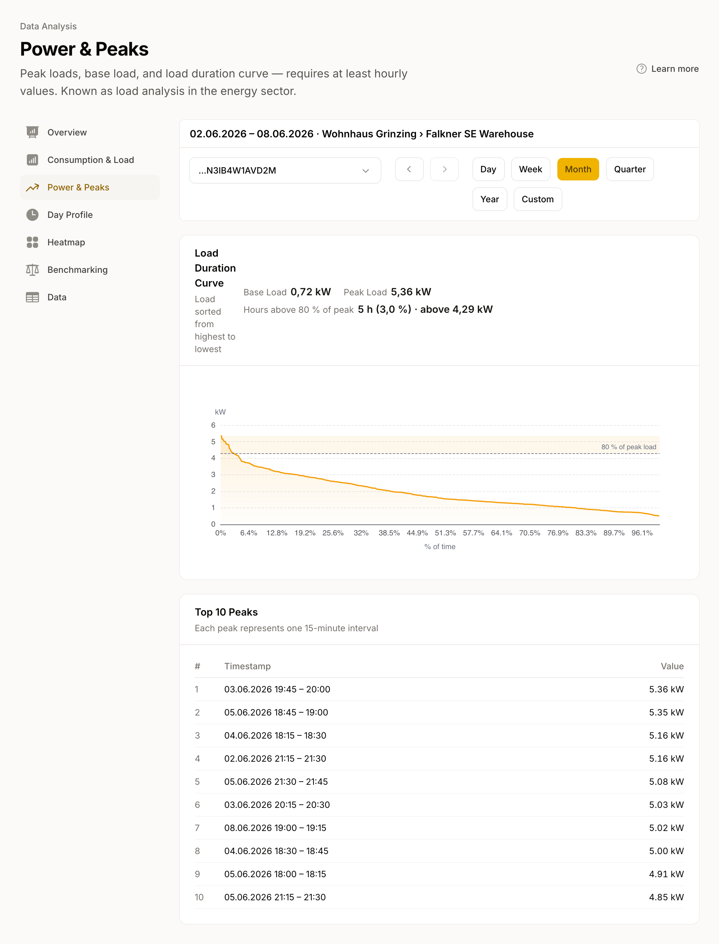
- Far left: Your peak load, the highest value on the curve. With several metering points this is their highest combined load.
- Far right: Your base load, the lowest continuous power.
- Steep curve: Your load fluctuates heavily, with a few high peaks and then a rapid drop. Typical for buildings with individual large consumers.
- Flat curve: Your load is evenly distributed. Typical for buildings with a constant base consumption.
A dashed line marks 80% of peak load. The narrow area above it shows how rarely the highest peaks occur. The area under the entire curve equals your total energy consumption in the period.
Top 10 Peaks
Below the curve we list the ten highest load peaks with exact timestamps. Each entry represents a single measurement interval, either 15 minutes or one hour depending on resolution. If only daily values are available, we show a notice instead. With multiple meters we also show the meter and location. This helps you find out when the peaks occurred and what might have caused them, for example simultaneously switched-on equipment or motor inrush currents.
For experts
The Load Duration Curve is a standard tool in energy management. It helps with the assessment of:
- Peak shaving: Can load peaks be reduced by shifting or storage? The steeper the left flank, the fewer hours carry the peak.
- Demand-side management: What share of the load is shiftable? The range between the peak and median consumption shows the theoretical potential.
- Peak duration: How much of the period do the highest quarter-hour averages cover? The "Hours above 80% of peak" figure above the chart gives it, measured against the whole period. The curve's time axis counts only measured intervals, so with data gaps it reads too high.
